How Much Food Will a Week’s Earnings Buy? (Fall Edition)
 (Click to enlarge.)
Signs of serious inflation in broad price indices such as the consumer price index (CPI) have been rare over the past few years, confounding many critics of the stimulus bill and the Fed’s efforts to reduce interest rates. However, as I reported in a blog entry last spring, most food-commodity prices were rising at that time and had reached levels rivaling those last seen in 2008, when unusually severe food shortages caused serious problems in many parts of the world.
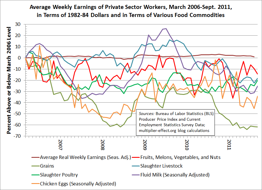
The figure at the top of this post is an update of the graph in the earlier post, based on data released this morning by the Bureau of Labor Statistics (BLS). The brown line shows the government’s estimate of the average real weekly wage for U.S. private sector employees. The series is of course adjusted for overall inflation, so that it represents actual purchasing power, not a number of dollars. (I have used a slightly different wage series than I used last time.)
The other lines show the same weekly earnings data series in terms of various categories of wholesale agricultural commodities, rather than a varied “shopping cart” of retail goods and services. Each line represents the value of average weekly earnings in terms of one major “food group,” to slightly misuse terminology from the federal government’s old dietary guidelines. For example, the data shown by the red line indicate that a worker measuring his or her weekly pay in an equivalent amount of fruits, melons, vegetables, and nuts would find that his or her weekly pay fell by 14.3 percent between March 2006 and last month.
Measured in any of the six commodity groups shown in the figure, wages have fallen by a large amount since March 2006, while they have risen very slightly according to the standard measure of real wages shown in the figure.
Incidentally, my April post used February 2011 BLS data. Here is a table showing how all 6 commodity groupings shown in the figure have fared since February, with price changes shown in percentage terms:
Commodity Price Changes, February-September, in Percent
| Fruits, Melons, Vegetables, and Nuts |
-24.6 |
| Grains |
+4.4 |
| Slaughter Livestock |
+3.8 |
| Slaughter Poultry |
+5.0 |
| Fluid Milk (Seasonally Adjusted) |
+3.1 |
| Chicken Eggs (Seasonally Adjusted) |
+14.5 |
The table shows that all of these prices, except for the first commodity group, have risen since February. (Note, October 20, 2011: An earlier version of this table, which appeared in Tuesday’s version of this post, reported percentage commodity-price changes from March to last month. Having realized this morning that my April post used February data, I have replaced the March-to-September price changes in the earlier version of the table with price changes since February. The original figures were accurate to my knowledge, but did not enable the reader to compare current price levels with the prices discussed in my April post.)
By the way, in case they are of interest, here are two recent links to analyses of the commodity-price situation: one by Krugman and another by Randy Wray. They focus on the very dubious hypothesis that low short-term interest rates and quantitative easing will soon bring high inflation, or even hyperinflation.
Indeed, it should perhaps be mentioned that the Fed’s recent policies are unlikely to be one of the main factors behind the price changes shown in the figure. Whatever the cause of the long-run increases that dominate the picture, many consumers who spend high percentages of their incomes on food are no doubt feeling their effects.


 ShareThis